My time at ATB Financial | Banking & FinTech
Increasing customer engagement with Android and iOS native app development: Everyday banking for Canadians made easier
Design problem
Over 800k ATB Financial customers (200k mobile users) were frustrated with a hard to use mobile app. Our team set out to go back to the basics and make banking on the go easier
My role
Dedicated UX designer for Android mobile, provide assistance to iOS mobile and web
Project outcome
The ratings in the app store increase from 1.6/5 to 4.5 stars
• Increased engagement from 31 to 44%
• Reduction in calls to customer support
• Reduced time for transfers, bill payments and payee management
Timeline
Project mobile redesign: 18months
Cross-currency feature: 3 weeks
Upon completion, app rating went from 1.6/5 to 4.5 stars, increased engagement from 31% to 44%, reduction in amount of calls to customer support and reduced time to complete payments and transfers.
200k mobile users were frustrated with hard to use banking app. We set out to change that.

How we made an app that helped banks make money and save money
Identified opportunities
Ability to find opportunities to align our design explorations with the goal of providing customer value.
Influenced decision making
Communicating the customer value to project partner's like product and engineering to influence feature prioritization.
Facilitated Collaboration
Facilitating design workshops and collaborating with greater project team to develop and execute a design solutions that addressed all challenges and business constraints.

Whiteboarding session with the UX team


This is the legacy app that customers were frustrated with and first review of some UX research to kick off fixing cross-currency transactions.
Making observations with analytics
Spotting opportunities in research that many people overlooked
The UX team did extensive discovery research to understand what specific pain points customers experienced with the legacy app. This required designers to partner with UX researchers to do contextual interviews with Albertans.
For example, while focusing on improving cross currency bill payments, we made it a priority from the start to understand why people do cross-currency transations and how we could add customer value.
Finding the key ingredient by analyzing competitor's strengths and weaknesses
Conducting a competitive analysis

Competitive analysis among most popular financial institutions
Competitive analysis done to map out and assess all the different UI approaches each financial institution takes. Assessing competitors gave us an opportunity to understand what customers are used to and how to potentially make it better.
Following the trail
Listening to the client and informing early sketches
Working as a team, we took the findings from the discovery research and used it during our brainstorming workshop I facilitated to inform our initial deisgn explorations.
Sketches here are from our virtual whiteboarding design workshop (done by multiple team members). Goal was to explore different was information could be laid out to help the client understand what is happening in the transaction.

Running a virtual whiteboarding workshop with other designers

When things got complicated with technical and legal constraints, we collaborated.
To bridge the gap from idea to execution, we mapped the initial soltuion framework to better understand how technical constaints, legal requirements and business systems would come together and affect the implementation of the design solution.
The team and I would put up options on the board and assess the pros and cons of each option.
My team members assessing information hierarchy,
Planning API calls with engineers early to be confident for sprint
System maps were designed to better understand which technical constraints would affect customer scenarios so we could plan accordingly

Technical mapping I designed with all possible use cases in early stages to help inform engineering spike and planning

Talking to Product team members early and often to size and scope features accurately on our roadmap
Basic user flows were also mapped out to better understand the scope of the solution. It was a great tool to foster conversation across different project partners.
Mapping out all customer scenarios to foster discussion with product team members for sprint planning
Constantly sketching to plan out future product eleases: Kicking off web redesign while planning for mobile
Brainstorming and sketching ideas to better understand how different interactions could affect the cross-currency transaction as we focus on deploying that feature in mobile as well as web banking.

Back to pen and paper to map out user needs and requirements
Content Blocking: Evaluating information hierarchy and helping the user
Content blocking was done for mobile designs to understand at which points in the interaction screens would be affected by the work. what interactions might help customers understand the exchange rate and converted amounts when they are using their phone.

Assessing how much screen real estate is being used for content and where most of user interaction would be


Making sense of complexity
Comparing component options for maximum customer value and development effort
To bridge the gap from idea to execution, we mapped the initial soltuion framework to better understand how technical constaints, legal requirements and business systems would come together and affect the implementation of the design solution.
The team and I would put up options on the board and assess the pros and cons of each option.
Comparing 2 component options to uncover maximum ease of use and which interaction would work best
Upon completion, app rating went from 1.6/5 to 4.5 stars, increased engagement from 31% to 44%, reduction in amount of calls to customer support and reduced time to complete payments and transfers


Results Final Design
Through multiple rounds of usability testing (A/B testing), it was determined that displaying as much information at once would help people get the task done in a way that made sense to them.

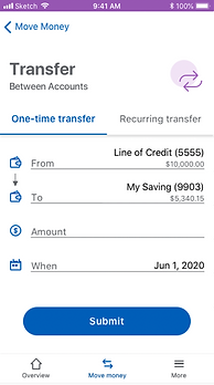

" It's so simple to use, I preferred that I could type in US or Canadian, I never thought about that...I thought it was super simple to use very straightforward. I didn't have to think too much about it because it was all laid out for me."
-Usability test participant
You might be interested in

CASE STUDY | DATA SECURITY
If your org struggles with engineering-led design, see how I turned a low UX maturity squad into a high-impact design machine in just 6 weeks.

CASE STUDY | AI & DATA PRIVACY
If your org has multiple teams going in different directions, see how with leadership I helped unify two designs, two products, two personas into one unified AI solution.